This page is part of archived documentation for openHAB 3.0. Go to the current stable version
# oh-button - Button
Button performing an action
# Usage / reference documents
- The
oh-buttoncomponent is based upon the Framework 7 Vue button control (f7-button) (opens new window). - Component styles are applied by the Framework 7 CSS variables (opens new window). For guidance on how to customise styles see the CSS Styles (opens new window) section.
- Use the
f7-segmentedwrapper component to group buttons together. Buttons with the propertyactive: trueset will be highlighted/marked as selected.
# Configuration
# General
# text Text TEXT
Button label
# round Round BOOLEAN
Makes button round
# large Large BOOLEAN
Makes button large
# small Small BOOLEAN
Makes button small
# fill Fill BOOLEAN
Makes button filled with color
# raised Raised BOOLEAN
Makes button raised
# outline Outline BOOLEAN
Makes button outline
# active Active TEXT
Button is active (when part of a f7-segmented
# iconF7 Icon TEXT
Framework7 icon to display (Framework7 icon)
# iconMaterial Icon TEXT
Material design icon to display
# iconColor Icon Color TEXT
Not applicable to openHAB icons
# iconSize Icon Size INTEGER
Size of the icon in px
# tooltip Tooltip TEXT
Button tooltip text to show on button hover/press
# variable Variable TEXT
Name of the variable to set on input change
# clearVariable Clear Variable After Action BOOLEAN
Name of the variable to clear after performing the action
# Action
# actionUrl Action URL TEXT url
URL to navigate to
# actionUrlSameWindow Open in same tab/window BOOLEAN
Open the URL in the same tab/window instead of a new one. This will exit the app.
# actionItem Action Item TEXT item
Item to perform the action on
# actionCommand Action Command TEXT
Command to send to the item. If "toggle item" is selected as the action, only send the command when the state is different
# actionCommandAlt Action Toggle Command TEXT
Command to send to the item when "toggle item" is selected as the action, and the item's state is equal to the command above
# actionOptions Command Options TEXT
Comma-separated list of options; if omitted, retrieve the command options from the item dynamically. Use value=label format to provide a label different than the option.
# actionRule Rule TEXT rule
Rule to run
# actionPage Page TEXT page
Page to navigate to
# actionModal Modal Page or Widget TEXT pagewidget
Page or widget to display in the modal
# actionModalConfig Modal component configuration TEXT props
Configuration (prop values) for the target modal page or widget
# actionPhotos Images to show TEXT
Array of URLs or objects representing the images. Auto-refresh is not supported.
Edit in YAML or provide a JSON array, e.g.[ "url1", { "item": "ImageItem1", "caption": "Camera" } ]
Objects are in the photos array format with an additional item property to specify an item to view.
# actionPhotoBrowserConfig Photo browser configuration TEXT
Configuration for the photo browser.
Edit in YAML or provide a JSON object, e.g.{ "exposition": false, "type": "popup", "theme": "dark" }
See photo browser parameters (not all are supported).
# actionGroupPopupItem Group Popup Item TEXT item
Group item whose members to show in a popup
# actionAnalyzerItems Item(s) to Analyze TEXT item
Start analyzing with the specified (set of) item(s)
# actionAnalyzerChartType Chart Type TEXT
The initial analyzing period - dynamic or a predefined fixed period: day, week, month or year
Options:
# actionAnalyzerCoordSystem Initial Coordinate System TEXT
The initial coordinate system of the analyzer - time, aggregate or calendar (only time is supported for dynamic periods)
Options:
# actionFeedback Action feedback TEXT
Shows a toast popup when the action has been executed. Can either be a text to show or a JSON object including some of the supported parameters
# actionVariable Variable TEXT
The variable name to set
# actionVariableValue Variable Value TEXT
The value to set the variable to
# Inherited Properties
The configuration is passed to the underlying f7-button component from Framework7 v5.
All compatible scalar properties (opens new window) (except functions) not listed above are available for use.
# Slots
# default
The contents of the button.
# Examples
# Header Image Source Code
This example code generates the button image used at the top of this page:
YAML
uid: oh-button
tags: []
timestamp: Feb 9, 2021, 5:42:56 PM
component: f7-card
config:
  title: oh-button
slots:
  default:
    - component: f7-block
      config:
        class: bog
        style:
          display: flex
          flex-wrap: wrap
          justify-content: space-between
          align-content: space-between
          height: 230px
          padding-bottom: 20px
      slots:
        default:
          - component: oh-button
            config:
              width: 400px
              text: Basic button
          - component: oh-button
            config:
              width: 400px
              text: Rounded + Outline
              round: true
              outline: true
          - component: oh-button
            config:
              text: Large
              outline: true
              large: true
              grid-colum: 3
              grid-row: 1
          - component: oh-button
            config:
              text: Small + Outline
              outline: true
              small: true
          - component: oh-button
            config:
              text: Filled
              fill: true
          - component: oh-button
            config:
              text: Raised
              fill: true
              raised: true
          - component: oh-button
            config:
              text: Outline
              outline: true
          - component: oh-button
            config:
              text: f7 icon
              iconF7: arrow_right_arrow_left_square_fill
              tooltip: Click to view f7 icons
              action: url
              actionUrl: https://framework7.io/icons/
          - component: oh-button
            config:
              text: Material icon
              iconMaterial: fingerprint
              tooltip: Click to view Material icons
              action: url
              actionUrl: https://material.io/resources/icons/
          - component: oh-button
            config:
              text: Icon color
              iconMaterial: power_settings_new
              iconColor: green
          - component: oh-button
            config:
              text: 40px icon, with custom button height to fit it!
              outline: true
              fill: true
              iconMaterial: report_problem
              iconSize: 40
              style:
                height: 80px
                width: 300px
                white-space: normal
          - component: oh-button
            config:
              text: Tooltip - hover over me
              tooltip: Don't Panic
          - component: oh-button
            config:
              text: Set variable 'myVariable'
              variable: myVariable
              action: variable
              actionVariable: myVariable
              actionVariableValue: 1
          - component: oh-button
            config:
              text: Clear variable 'myVariable'
              clearVariable: myVariable
              action: variable
              actionVariable: myVariable
          - component: f7-segmented
            slots:
              default:
                - component: oh-button
                  config:
                    text: Option 1
                    outline: true
                    style:
                      width: 200px
                - component: oh-button
                  config:
                    text: Option 2 (Active)
                    outline: true
                    active: true
                    style:
                      width: 200px
                - component: oh-button
                  config:
                    text: Option 3
                    outline: true
                    style:
                      width: 200px
# action: navigate
action: navigate allows you to navigate to another page (Administration -> Settings -> Pages) within the openHAB application.
The target page is specified with the name of the page in the actionPage property.
For example to create a button to take users to the main overview (home) page, set actionPage: page:overview.
The value after the page: is the page ID not the page Label.
YAML
uid: oh-button-action-navigate
tags: []
timestamp: Feb 15, 2021, 8:32:44 PM
component: f7-card
config:
  title: "oh-button > action: navigate"
slots:
  default:
    - component: f7-block
      config:
        class: bog
        style:
          display: flex
          flex-wrap: wrap
          justify-content: space-between
          align-content: space-between
          padding: 20px
      slots:
        default:
          - component: oh-button
            config:
              width: 400px
              iconF7: house_fill
              text: Home Page
              outline: true
              action: navigate
              actionPage: page:overview
              style:
                width: 250px
# action: command
action: command allows you to send a command actionCommand to an item, specified in the actionItem.
This example shows how to send ON and OFF commands to an item e.g. a light, using two buttons.
YAML
uid: oh-button-action-command
tags: []
props:
  parameters:
    - context: item
      description: Select the item to use with these buttons.
      label: Item
      name: item
      required: true
      type: TEXT
      groupName: general
  parameterGroups:
    - name: general
      label: Display options
timestamp: Feb 15, 2021, 9:21:10 PM
component: f7-card
config:
  title: "oh-button > action: command"
  footer: Set the properties to any item that accepts an ON/OFF commands
slots:
  default:
    - component: f7-block
      config:
        class: bog
        style:
          display: flex
          flex-wrap: wrap
          justify-content: space-between
          align-content: space-between
          padding: 20px
      slots:
        default:
          - component: f7-segmented
            slots:
              default:
                - component: oh-button
                  config:
                    text: On
                    outline: true
                    action: command
                    actionItem: =props.item
                    actionCommand: ON
                    active: "=(items[props.item].state === 'ON') ? true : false"
                    style:
                      width: 100px
                - component: oh-button
                  config:
                    text: Off
                    outline: true
                    action: command
                    actionItem: =props.item
                    actionCommand: OFF
                    active: "=(items[props.item].state === 'OFF') ? true : false"
                    style:
                      width: 100px
# action: toggle
action: toggle is used to change any item that supports two states e.g. a lamp that is either ON or OFF or blinds that are OPEN or CLOSED.
Use actionCommand and actionCommandAlt to specify the commands to switch between.
If you need the item to change to more than two states e.g. a dimmable light, see the previous example and specify a button for each of the dimming levels required e.g. 0%, 25%, 50% 75%, 100% or use actionOptions to select the required option.
YAML
uid: oh-button-action-toggle
tags: []
props:
  parameters:
    - context: item
      description: Select the item to use with these buttons.
      label: Item
      name: item
      required: true
      type: TEXT
      groupName: general
  parameterGroups:
    - name: general
      label: Display options
timestamp: Feb 15, 2021, 9:55:56 PM
component: f7-card
config:
  title: "oh-button > action: toggle"
  footer: Set the properties to any item that accepts an ON/OFF commands
slots:
  default:
    - component: f7-block
      config:
        class: bog
        style:
          display: flex
          flex-wrap: wrap
          justify-content: space-between
          align-content: space-between
          padding: 20px
      slots:
        default:
          - component: oh-button
            config:
              text: Off
              outline: true
              action: toggle
              actionItem: =props.item
              actionCommand: ON
              actionCommandAlt: OFF
              style:
                width: 100px
# action: options
action: options provides the ability to send a command from a list of options. Options are displayed at the bottom of the screen when the button is clicked. Options are specified either in the actionOptions property or if this is omitted from the Command Options metadata specified on the item.
YAML
uid: oh-button-action-options
tags: []
props:
  parameters:
    - context: item
      description: Select the item to use with these buttons.
      label: Item
      name: item
      required: true
      type: TEXT
      groupName: general
  parameterGroups:
    - name: general
      label: Display options
timestamp: Feb 15, 2021, 11:57:34 PM
component: f7-card
config:
  title: "oh-button > action: options"
  footer: Set the properties to any item that accepts percentage commands e.g. dimmable light
slots:
  default:
    - component: f7-block
      config:
        class: bog
        style:
          display: flex
          flex-wrap: wrap
          justify-content: left
          padding: 20px
      slots:
        default:
          - component: f7-segmented
            slots:
              default:
                - component: oh-button
                  config:
                    text: Dimming Level
                    outline: true
                    action: options
                    actionOptions: 0=Off, 25=25%, 50=50%, 75=75%, 100=Full
                    actionItem: =props.item
                    style:
                      width: 300px
# action: rule
action: rule is used with the actionRule property to run a rule (Administration > Settings > Rules).
YAML
uid: oh-button-action-rule
tags: []
props:
  parameters:
    - context: rule
      description: Click the button to run a rule.
      label: Rule Name
      name: rule
      required: true
      type: TEXT
      groupName: general
  parameterGroups:
    - name: general
      label: Display options
timestamp: Feb 16, 2021, 12:10:45 AM
component: f7-card
config:
  title: "oh-button > action: rule"
  footer: Set the properties to a rule to run.
slots:
  default:
    - component: f7-block
      config:
        class: bog
        style:
          display: flex
          flex-wrap: wrap
          justify-content: left
          padding: 20px
      slots:
        default:
          - component: f7-segmented
            slots:
              default:
                - component: oh-button
                  config:
                    text: Run automation rule
                    fill: true
                    action: rule
                    actionRule: =props.rule
                    style:
                      width: 300px
# action: popup / action: popover / action: sheet
The popup, popover and sheet actions provide a way to display user interface pages in specific window formats. Typically these screens are used to display additional detail or access additional settings that have been omitted for brevity from the parent page.
Pages should normally be specifically designed for your chosen display method. The popover area favours organisation of widgets in columns, but the sheet window occupies the full width of the lower part of the screen and therefore a horizontal layout is preferable.
The example code simply displays a copy of your main 'Overview' page (as all users have this page) in each window style. As this page is rarely designed with this purpose in mind the design challenge is usually clear!
action: popupis used with theactionModalproperty to open a page as a modal popup window in the centre of the screen. Clicking on theBackbutton or anywhere else on the screen will close the popup window.action: popoveris used with theactionModalproperty to open a page as a modal popup window as a vertical rectangle to the left of the screen (over the menu area, if displayed).action: sheetis used with theactionModalproperty to open a page as a modal popup windows as a horizontal rectangle across the bottom of the screen.
YAML
uid: oh-button-action-popup-popover-sheet
tags: []
timestamp: Feb 16, 2021, 1:01:08 AM
component: f7-card
config:
  title: "oh-button > action: popup | action: popover | action: sheet"
  footer: Set the properties to any item that accepts percentage commands e.g. dimmable light
slots:
  default:
    - component: f7-block
      config:
        class: bog
        style:
          display: flex
          justify-content: left
          padding: 20px
      slots:
        default:
          - component: oh-button
            config:
              text: Open PopUp
              outline: true
              action: popup
              actionModal: page:overview
              style:
                width: 300px
                margin-right: 10px
          - component: oh-button
            config:
              text: Open PopOver
              outline: true
              action: popover
              actionModal: page:overview
              style:
                width: 300px
                margin-right: 10px
          - component: oh-button
            config:
              text: Open Sheet
              outline: true
              action: sheet
              actionModal: page:overview
              style:
                width: 300px
# action: photos

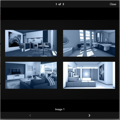
action: photos allows you to open a Framework 7 (v5) Photo Browser object (opens new window).
This component displays a collection of photos and video images.
Photos can be zoomed and panned.
Typical applications for this control include the display of security camera images or videos.
actionPhotos accepts a YAML or JSON object that specifies the URL or HTML and captions for your images and videos.
  actionPhotos:
    - url: http://openhabian:8080/static/photos/image1.jpg
      caption: Image 1
    - url: http://openhabian:8080/static/photos/image2.jpg
    - html: <video src="http://openhabian:8080/static/videos/video1.mp4"></video>
      caption: Garden Camera
The actionPhotoBrowserConfig accepts a YAML or JSON array that specifies the configuration properties for the Photo Browser object.
  actionPhotoBrowserConfig:
    exposition: false
    type: popup
    theme: dark
YAML
Amend the file names / URL to your image file names before testing! Nothing will be displayed if the image/video locations are not valid.
uid: oh-button-action-photos
tags: []
timestamp: Feb 16, 2021, 3:17:05 PM
component: f7-card
config:
  title: "oh-button > action: photos"
  footer: Click to open the Photo Browser dialogue
slots:
  default:
    - component: f7-block
      config:
        class: bog
        style:
          display: flex
          flex-wrap: wrap
          justify-content: space-between
          align-content: space-between
          padding: 20px
      slots:
        default:
          - component: oh-button
            config:
              text: Camera 1
              outline: true
              action: photos
              actionItem: =props.item
              actionPhotos:
                - url: http://openhabian:8080/static/photos/image1.jpg
                  caption: Image 1
                - url: http://openhabian:8080/static/photos/image2.jpg
                - html: <video src="http://openhabian:8080/static/videos/video1.mp4"></video>
                  caption: Garden Camera
              actionPhotoBrowserConfig:
                exposition: false
                type: popup
                theme: dark
# action: group

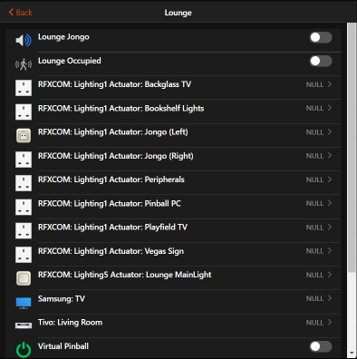
action: group opens a popup which displays the items that are members of the group specified by the actionGroupPopupItem.
YAML
Change actionGroupPopupItem property to a value that matches a group defined in your own configuration.
uid: oh-button-action-group
tags: []
timestamp: Feb 16, 2021, 4:20:16 PM
component: f7-card
config:
  title: "oh-button > action: group"
  footer: Click to show the items in the Lounge
slots:
  default:
    - component: f7-block
      config:
        class: bog
        style:
          display: flex
          flex-wrap: wrap
          justify-content: space-between
          align-content: space-between
          padding: 20px
      slots:
        default:
          - component: oh-button
            config:
              text: Lounge
              outline: true
              action: group
              actionGroupPopupItem: gLounge
# action: analyzer
action: analyzer opens a popup which displays a graph based on the values of the items listed in actionAnalyzerItems.
Multiple items can be specified in actionAnalyzerItems using the YAML list format i.e. [item1,item2,item3].
actionAnalyzerChartType specifies the initial period to analyze.
If no value is specified initial period is dynamic.
Periods can be adjusted after the graph is displayed, using the standard controls.
actionAnalyzerCoordSystem specifies the initial coordinate system of the analyzer.
Only time is supported for dynamic periods.
Beware NULL values
If your graph does not display any data, check that none of items added to the graph are NULL. A single NULL item prevents all data from being displayed.
YAML
Change actionAnalyzerItems property to a value that matches an item defined in your own configuration.
uid: oh-button-action-analyzer
tags: []
timestamp: Feb 16, 2021, 5:37:45 PM
component: f7-card
config:
  title: "oh-button > action: analyzer"
  footer: Click to analyze ground floor HVAC temperatures
slots:
  default:
    - component: f7-block
      config:
        class: bog
        style:
          display: flex
          flex-wrap: wrap
          justify-content: space-between
          align-content: space-between
          padding: 20px
      slots:
        default:
          - component: oh-button
            config:
              text: HVAC Ground Floor
              fill: true
              action: analyzer
              actionAnalyzerItems: [ZWaveNode002StellaZThermostaticValve_Sensortemperature, ZWaveNode005StellaZThermostaticValve_Sensortemperature]
# action: url

action: url navigates to the web page specified in the actionUrl property. actionUrlSameWindow set to true to open in the same window, or false to open in a seperate window\tab.
YAML
uid: oh-button-action-url
tags: []
timestamp: Feb 16, 2021, 6:52:30 PM
component: f7-card
config:
  title: "oh-button > action: url"
  footer: Click to open the specified website
slots:
  default:
    - component: f7-block
      config:
        class: bog
        style:
          display: flex
          justify-content: left
          padding: 20px
      slots:
        default:
          - component: oh-button
            config:
              text: OpenHAB Community
              fill: true
              action: url
              actionUrl: https://community.openhab.org/
              actionUrlSameWindow: false
              style:
                width: 300px
                margin-right: 10px
          - component: oh-button
            config:
              text: Documentation (same window)
              fill: true
              action: url
              actionUrl: https://www.openhab.org/docs/
              actionUrlSameWindow: treu
              style:
                width: 300px
                margin-right: 10px
# action: variable
action: variable creates and/or sets the variable specified in actionVariable to the value specified in actionVariableValue. Variables are stored in the vars object and can be accessed by other objects using vars.[your variable name].
YAML
TBA
# Community Resources
UI Widget: Keypad (opens new window) - using action: command and action: variable, this widget will allow users to enter a numerical PIN code (plus * and #) and send a command with the result to a predefined item when pressing the Send button.

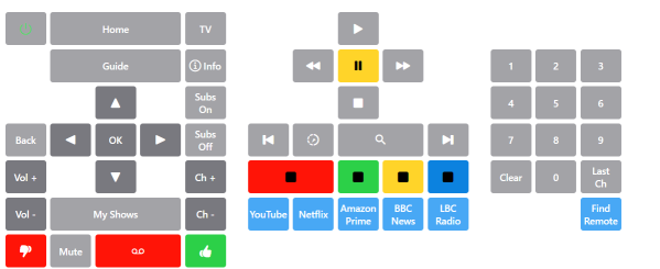
BoGoB: Big Ol' Grid O' Buttons (opens new window) - using the oh-button and oh-repeater objects together with YAML arrays to create large grids of buttons (emulating remote control operation).

